Home Is Where The Hive Is
Tuesday, 1st May 2018Guest blog by Tom Giddings, Architectural Technician at Rider Levett Bucknall.
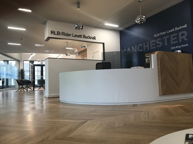
The end of March saw Rider Levett Bucknall (RLB) move into their brand spanking new office at One King Street, Manchester. Now the dust has settled and the tea and biscuits have been unpacked it is time for a quick review of the design and the decisions that they made to build an environment that was bespoke to them and in keeping with the company vision.

It is any designers dream to be given free rein on a new space, so naturally we when were given the nod for feasibility we decided to pull out all the stops to ensure the design stayed in house from start to finish. To achieve this we had to win over the Boss, the Board and the Staff. And so began the stakeholder engagement process where at times could only be described as being a one armed juggler in a minefield of opinions. To encourage the staff to become engaged and dare I say, ‘excited’ the designs were 3D modelled with rendered visualisations to give a clear picture of where we wanted to take the look and feel of the office.
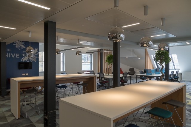
Right from the start we wanted to create a fun, working office that encouraged the spirit and essence of Manchester without it becoming or sounding like a pretentious case study. We were lucky enough to be given Number One as a blank canvas to start with and credit has to be given to the original base fit out. We wanted to keep the Industrial sense of the old Kendals building so decided to incorporate the raw brickwork and exposed steel columns into the architecture of the design, which luckily, contrasted nicely with the clean white lines of the RLB brand.

We wanted to break the mould without breaking the mould. In short, it had to work. We focused on subtle elements that challenged our existing working habits but when brought together made a massive impact. Simple things such as having desk mounted monitors, collaboration hubs, biophilia, contemplation zones and variable sit stand workstations have boosted productivity and staff morale, nothing out of the ordinary from your standard wellbeing design guide. That wasn’t to say that we haven’t had our fair share of teething troubles – installing the wood flooring, glass and hard furniture made us think about the benefits of an acoustician!
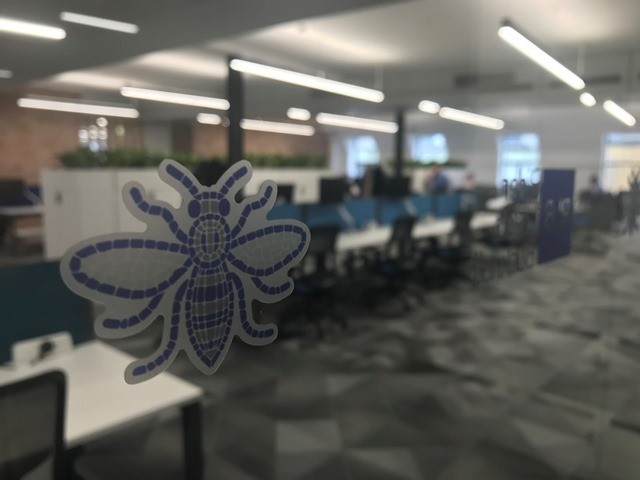
Part of the decision of the office move was to become more centralised within the city centre of Manchester and as such we wanted to ingrain Manchester’s industrial heritage and its quirky ‘northern-ness’ onto the office. The decision came quickly to build a theme around each of our new meeting rooms with bespoke graphic wallpapers that encompasses a different Manchester based category; Science, Music, Art, Innovation, Engineering and Sport.

Keeping the design in house allowed us to have a greater control over how the finished product would look, feel and most importantly cost. However, the project wouldn’t have been such a success without the hard work and patience of the Contractors. Special thanks must go to Flexible Business Interiors (FBI), especially when waiting for the umpteenth design revision on a layout drawing.
The overall feeling of the office is a creative space where you can take 5 minutes out to reflect, or knuckle down and send that final email at 16:35 on a Friday. But don’t take our word for it, come in and help us test out the coffee.